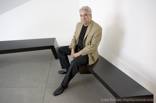
George Calys
Photos by Luke Thomas
By George Calys
June 6, 2008
“When we build let us think we build forever. Let it not be for present delight nor for present use alone. Let it be such work that our descendants will thank us for, and let us think, as we lay stone upon stone, that a time is to come when these stones will be held sacred because our hands have touched them, and that men will say, as they look upon the labor and wrought substance of them, ‘See! This, our fathers did for us.’”
–John Ruskin (1809-1900)
In the history of American architecture, Chicago has always held the place of preeminence while San Francisco has, with a few exceptions, never been viewed as a leader in the modern movement. As a city that since Gold Rush days has always embraced the new, the innovative, and the avant-garde, our architecture has often merely copied older traditional forms or, sadly, been a feeble attempt at modern expression. One look at the Marriott Hotel on Fourth Street is enough to confirm that.
Daniel Libeskind’s new Contemporary Jewish Museum, located in the Yerba Buena Gardens redevelopment district, has powerfully raised the bar of modern architecture and design in San Francisco. Libeskind’s blending of an historic industrial building and a new, bold addition will impact Bay Area design for years to come, perhaps altering San Francisco’s parochial view of modern architecture.
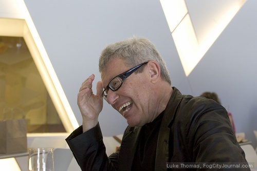
Contemporary Jewish Museum Architect, Studio Daniel Libeskind.
I recently toured the museum and visited with Libeskind. The insider’s perspective led me to a newfound respect for this architect and his latest opus.
Genesis of the Project
The story of the Contemporary Jewish Museum began almost a quarter century ago with the creation of the Yerba Buena Redevelopment District. The goal of the redevelopment district was to create a new cultural enclave within the South of Market area that was historically populated with industrial buildings. Several cultural institutions would grow out of this redevelopment scheme, including Yerba Buena Center for the Arts, the Museum of the African American Diaspora, the as-yet unbuilt Mexican Museum, and the Contemporary Jewish Museum. A commercial venture, the Sony Metreon, would act as the economic engine to pay for the various public improvements, the most notable of which is the Yerba Buena Garden, a quasi-public park.
The Jewish Museum of San Francisco, a rather small institution hidden away in the south Financial District, took on the project about ten years ago and engaged Studio Daniel Libeskind, who was then receiving accolades (and a certain amount of controversy too) for his nearly completed Jewish Museum in Berlin. The San Francisco Museum was offered the former PG&E Jessie Street power station as a location with the provision that a significant portion of the vacant industrial building be used in the museum design. Libeskind, in a very early conceptual sketch, envisioned the 1907 building with blue crystalline structures emanating from it.
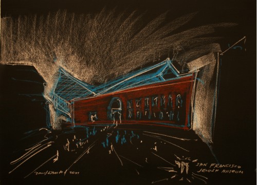
Courtesy CJM.
Midway through the process, the San Francisco Jewish Museum merged with the Berkeley-based Judah L. Magnes Museum, its East Bay equivalent. Together, it was thought, the two institutions could more effectively raise the funds needed as a single, unified organization. The vision of the Museum became grander and the building program was expanded in anticipation of the funds that would soon be rolling in. Libeskind’s design grew accordingly.
But it wasn’t meant to be.
The two organizations, now one, found they had different and, ultimately, irreconcilable ideas. After about two years, the two organizations “unmerged” and the project became the sole responsibility of the San Francisco group. That also meant that the budget was reduced and a scaled back design would be necessary. While this could be viewed as a setback architecturally and a lot of redo work for Libeskind’s office, I would posit that the redesign actually created improvements to the building, causing Libeskind’s design sense (and of course the design itself) to evolve.
The Chai Symbolism
Libeskind’s design from the initial stages embodied two highly angular crystalline forms that grew out of the power house building. The shape of these “crystals” was derived from the Hebrew letters chet and yud which together form the word chai (life), from which is derived the well known toast l’chaim (to life). Libeskind’s stylized use of the two letters form the basis for the crystalline structures which have become the additions to the 1907 building. Libeskind himself linked the traditional chai to the highly modernist forms of the crystals, hearkening back to Berlin museum where he linked the deconstructed plan of that building to a Star of David.
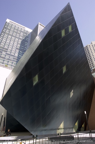
Is the use of these angular forms, these crystals, a mere tour de force, a happy coincidence of Hebrew letters and a blue-clad cube attached to an old building? The answer lies in that fact that the crystalline structures are actually outgrowths of the building interior; what Frank Lloyd Wright would have called organic architecture, the idea that a building’s exterior is an expression of what happens in its interior. I think Libeskind satisfies that criteria. If one were to stand in the building’s lobby without even having seen the exterior, you would guess that those crystalline structures exist on the outside of the building—they’re organic in the Wrightian sense.
Building Program
The building program (the size and number and function of interior spaces) is not dramatic. It couldn’t be, in the end, because the overall size of the project changed when the two organizations split apart. Besides a generous lobby (that also functions as a pre-event space), there is a museum shop, educational rooms, and only three galleries. The spatial volumes are large but square footage is not that large. For a museum that doesn’t possess any permanent exhibitions this makes some sense.
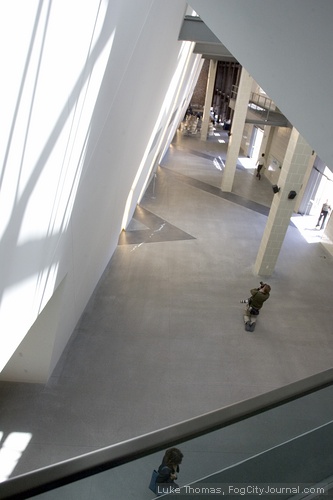
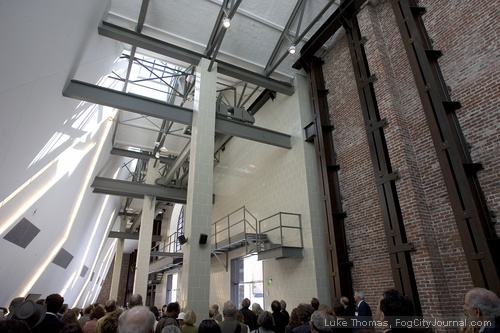
The reuse of the old PG&E power station was mandated by the San Francisco Redevelopment Agency, but it’s hard to imagine this museum without the power station being a part of it. Libeskind likened it to the traditional having connection to the new; the traditions of Judaism connected to contemporary life. The museum ultimately decided to call itself the Contemporary Jewish Museum to highlight this connection.
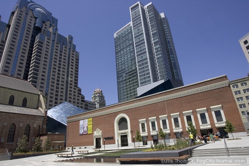
The old PG&E façade that now faces Mission Street (it used to front only an alley and was barely visible) has been lovingly restored. More interestingly, many of the building’s original structural elements—columns, beams, even an industrial hoist—have been retained and were painted consistently grey as a reminder of the industrial use of the building.
Gallery Space
With only three gallery spaces, flexibility was paramount. Two of the galleries are so-called black boxes—rooms with no natural light that can be configured for each new exhibition. It is in the yud gallery, the gallery within the westernmost crystal structure, that we see Libeskind at his expressive, angular best. This gallery is without straight walls or right angles and with its 36 windows (twice the number 18, significant in Hebrew numerology) that we find a gallery that in Libeskind’s own words, “will not house 19th century paintings.” This gallery couldn’t house a painting if you wanted it to; there’s no place to hang anything. Instead, the museum envisioned the gallery as a place for performance or meditation or, as is currently there, an audio installation.
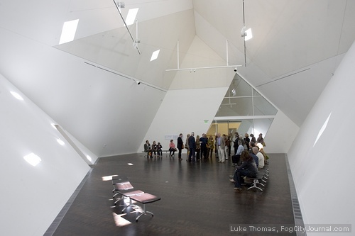
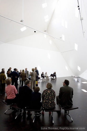
From this gallery, within the crystal structure, the yud, radiates every other angle of the building. It’s as though the soul of the building resides in that space and the lines of the gallery walls resonate to every nonvertical wall or ceiling throughout the rest of the museum. This expression is the classic Libeskind we first saw in the Berlin Jewish Museum, and recently in the addition to the Denver Art Museum. Here, however, the angles are restrained and disciplined and, I think, more coherent. It was as if the redesign of the museum required by the decrease in the project size and scope, forced Libeskind into an evaluation or perhaps an evolution of his own design aesthetic. In some real sense, a budgetary setback may have actually enhanced the architecture and reigned in the architect’s natural exuberance.
Lighting and Materials
Light, especially natural light, is the enemy of museums with their sensitive objects and collections. The Contemporary Jewish Museum, however, feels like a light filled place. Libeskind achieved that by bringing copious amounts of natural light into the public spaces, where people will move and congregate, but where art work will not be shown. The overall effect, the trick as it were, is to make the entire interior feel as though outside light streams is filling the museum interior.
The interior use of materials is judicious and uncomplicated, which fits a museum. The walls can’t really compete with the exhibitions, can they? But the exterior, particularly the crystalline structures, is where Libeskind, in the words of one television chef, “kicked it up a notch.” Clad in luminous blue steel panels, they are quite unlike anything else in San Francisco.
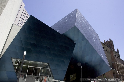
A vivid, almost cobalt blue during the day, at night they acquire an almost evanescent glow as the lights of nearby buildings reflect off them. Those blue crystals, growing as they do out of the 1907 Willis Polk power station, tell us that this is a building of our time, a building not possible in any other time, a contemporary building. Because those bold exterior blue crystals are informed by and grow out of the building interior, Libeskind has achieved a modern expression of architecture, in the finest sense that that term conveys.
A Place in the City, a Place in Architecture
Has Libeskind’s work raised the bar, as I suggested earlier? Will this building challenge a new generation of design and construction in San Francisco? Will our city turn from an introspective, mired-in-the-past view of architecture to a forward thinking, bold vision of global design?
The CJM, clearly and firmly creates a new civic place; bounded by the museum, St. Patrick’s church, Mission Street and the yet unbuilt Mexican Museum, Jessie Square will take its place in the urban context of San Francisco. As importantly, the museum will fulfill its role as a venue where the contemporary contributions of Jews in America are linked to the spiritual and cultural traditions of other times and places.
For San Francisco, architect Daniel Libeskind has left a powerful architectural statement and one as meaningful as any the City has seen in the last quarter century. Perhaps in years to come as our offspring “look upon the labor and wrought substance” of the blue crystals still growing from the neoclassical power station, they too will exclaim that the San Francisco of 2008 got this one right.
George Calys is an architect and writer living in the Bay Area. He has written extensively on architecture. His next article will appear in Urban Land magazine where he will review a mixed use rehab of a brewery in Wroclaw, Poland. He is an occasional contributor to Fog City Journal.


 The Hunger Site
June 8, 2008 at 10:44 pm
George definitely knows what he’s talking about. His passion for architecture was quite apparent during his interview with Libeskind.
June 8, 2008 at 2:11 pm
I just loved this article! Excellent writing and, of course, terrific pictures. One gets the feeling George actually knows what he is talking about…